Pulse Voices
2026
Introducing the Inbox Approach: Redesigning How Participants Navigate Pulse Voices
The new panelist experience led to increased invite acceptance and more study applications per user.

OVERVIEW
A redesigned navigation around a single inbox model.
Over time, multiple shifts in the research platform left the Pulse Voices product structure feeling disjointed for participants. The Design Director trusted me to help envision the future of the platform for the participants our customers and we depend on.


Before and after: Pulse Voices experience on web
PROBLEM
Our participants needed (the right) support.
Participants had to hunt across disconnected tabs and message types just to find and act on a study invite. When they ran into an issue, there was confusion on who to reach out to: our customer or our internal support. This confusion led to participants reaching out to our customers (the researchers) and our research managers for support.
~50%
of support tickets were related to using the app (not the studies) and many app support requests were going directly to our customers instead.
Too many features were layered too fast. Each singular, additional feature would have made it worse.
Tight deadlines, shifting scope, and third-party constraints discovered mid-process.
RESEARCH & DISCOVERY
Data we started with
Analytics
Low onboarding completion, low notifcation tap-through
Existing user research
Support tickets
Participants were missing time-sensitive invites and commonly asking "where's my study"
What I did to learn more
I audited support tickets, reviewed drop-off funnels, met with the PM on customer concerns, and ran a competitive analysis. Dscout was the closest comparable product, but without the third-party integration constraints we were designing around.
Overall Insights
New users suffer the most.
Messaging became a catch-all with no hierarchy.
Notification confusion -> missed invites -> study fill-rate problem
DESIGN PROCESS
Getting Started
I started out by working with our product manager to go through our app and gather support tickets from our research team. After analyzing what we had, I did a competitive analysis on what other companies were doing with their apps. Dscout was the closest to what we do, but had less use complexities that I needed to account for. Our product relied on SurveyJS for survey functionality and CometChat for in-app messaging.
In addition, we were in the process of reworking and expanding our capture methods. So, the objective became to design a seamless experience around two external platforms with their own UX patterns, constraints, and limitations.
Key Decisions
Studies -> Projects
As studies evolved to include multiple capture methods and ongoing tasks, I reframed them as projects. The alternative was continuing to scale studies incrementally, but clean data architecture on the researcher side needed a participant-facing model to match it.

In Progress, First
I kept active projects as the opening view despite internal pressure to lead with new opportunities. With project scopes trending longer, participants needed to check current work first. The team was already handling recruitment outreach separately, so discovery didn't need to compete for the top of the screen.

Inbox Approach
Rather than a notification bell and a flat project feed, I drew from email to create a unified space for researcher messages, invites, and notifications. The old design created confusion between notifications and messages, and it kept past projects buried (where payouts live).

Action Items -> Project Details
I moved action items from the dashboard into a new detail page for each project. The actions list at the top seemed logical, but it didn't separate project tasks from internal actions. The most important task per project still surfaces on the dashboard card, keeping tasks visible without the clutter.

Iterations

ROUND 1
Reorganized old structure, but it isn't enough to solve for all issues.

ROUND 2
Inbox added; action items still live on the dashboard, creating clutter.
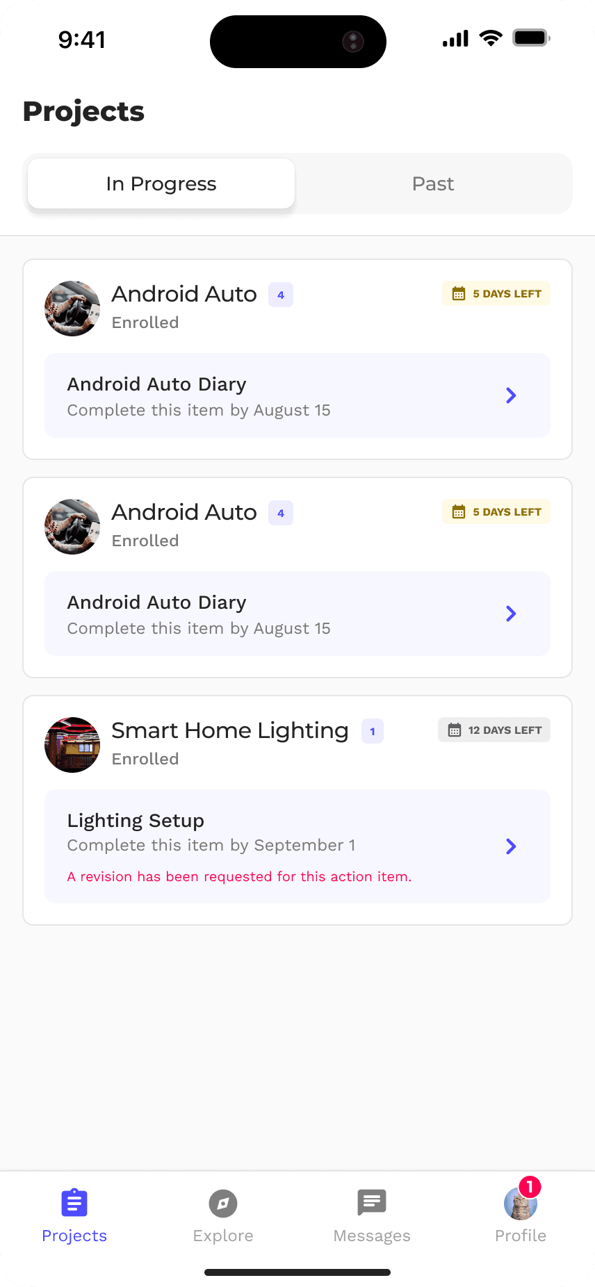
FINAL
Inbox anchors everything; one action per card on the dashboard.
OUTCOME & RESULTS
The solution
Participants now open the app to a clear view of where they stand: what projects they're actively in, what needs their attention, and what's waiting in their inbox, without having to hunt across tabs or decode which notification type means what. The inbox consolidates researcher messages, project invites, and internal notifications into a single, scannable space organized by relevance.
Studies have been reframed as projects, reflecting the reality of how they're structured on the researcher side and the experience now scales naturally with that, whether a participant is doing a quick one-time task or contributing to a bigger, ongoing project. Action items live inside each project rather than competing for space at the top level and the dashboard surfaces just enough to orient without overwhelming. Lastly, participants are one tap away from exploring new opportunities and they’re led to the explore tab from the start when they aren’t involved in any projects yet, through a CTA null state.
Key features
Unified Inbox
Researcher messages, invites, and notifications can live in one scannable place.
Faster Dashboard Scan
Active projects surface with each most important action at a glance.
Less Clutter
Full task lists live within each project detail page for more context.
Studies Projects
This model scales naturally with longer-term, multi-task work.
Guided Null State
New users are led directly to the Explore tab when no projects are active.
The Results
Fewer usability
& support tickets
REFLECTION
What worked
Working closely with the PM early to dig into support tickets before jumping to solutions helped make the research phase feel credible and gave the team confidence that the redesign was grounded in real pain rather than a design preference.
Leading with the inbox model as an organizing principle rather than trying to incrementally fix the existing tab structure was the right call. It gave the whole redesign a clear rationale that the team could align behind, and it made individual decisions — like where action items live — easier to justify because they all served the same logic.
Keeping In Progress projects at the forefront despite internal pushback was also the right instinct. The pressure to surface new opportunities first made sense commercially, but it would have created a worse experience for participants who had active commitments. Holding that line preserved the trust-building the redesign was trying to achieve.

What I'd do differently
Test with participants earlier
Internal review alone cost us more iteration between rounds. Earlier feedback could have caught issues sooner,
Audit third-party constraints upfront
SurveyJS and CometChat limitations were discovered after starting rather than being mapped at the start, which created avoidable scope adjustments and an entire round of iteration for messaging constraints.
Add payout visibility with its own treatment
Anchoring payouts to Past Projects works for now, but it's high-stakes enough to deserve a dedicated design pass when the development environment allows for it.
What I learned
Incremental additions without a north star will always compound
Structure decisions matter more than visual ones
Third-party integrations needs additional systems thinking